Home
About
Contact
Client
Haz Beauty/One & Oily
Role
Packaging Design
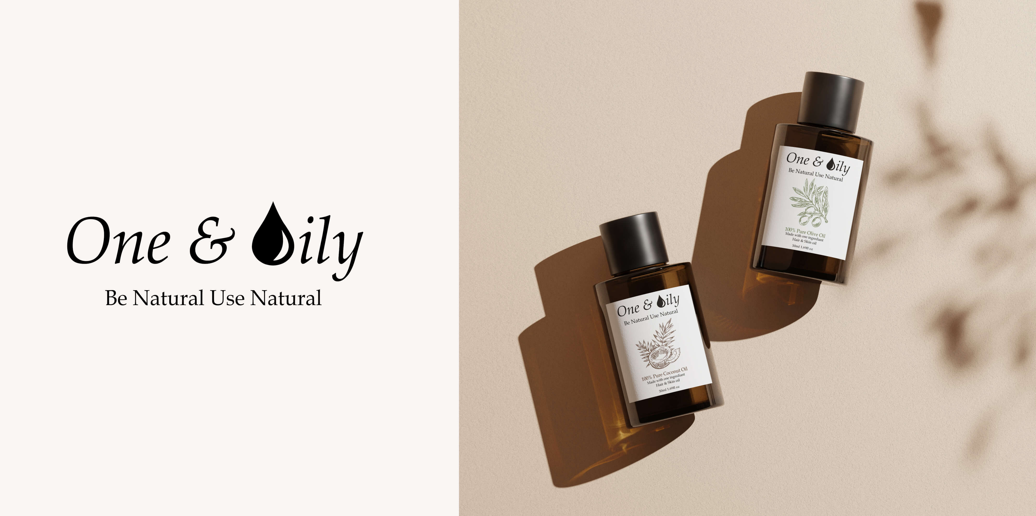
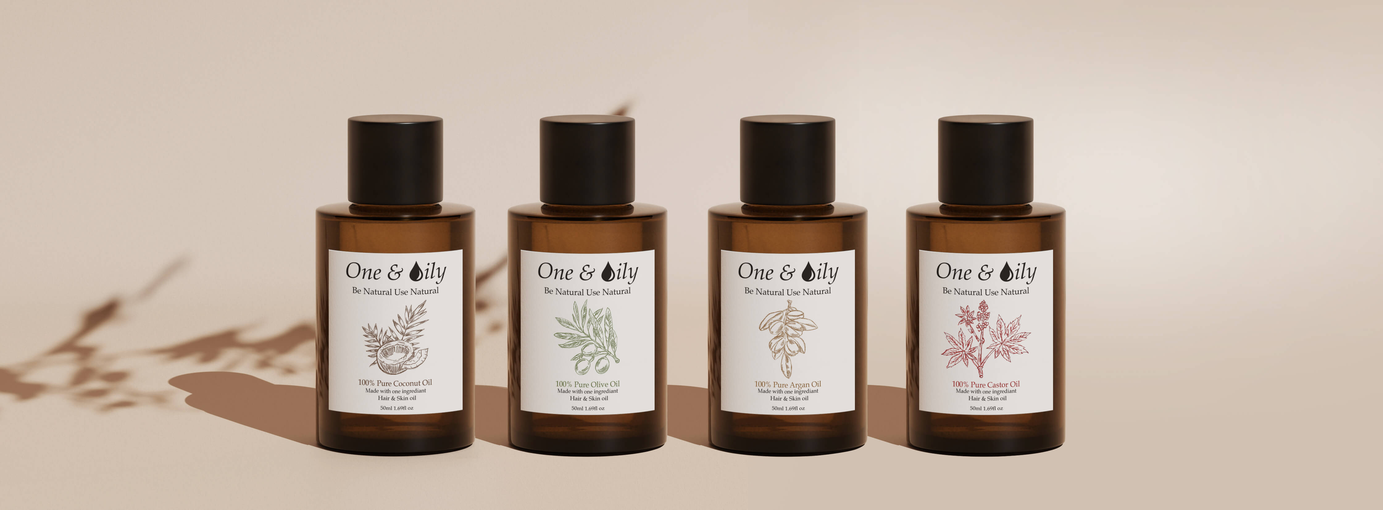
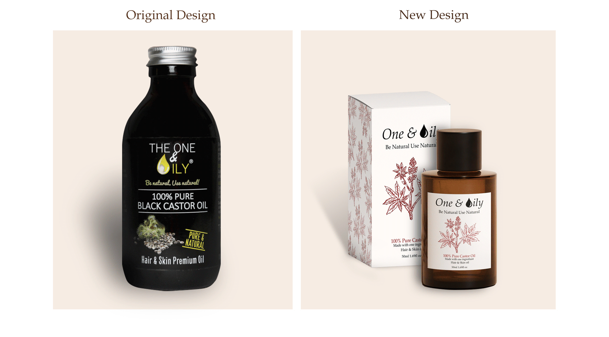
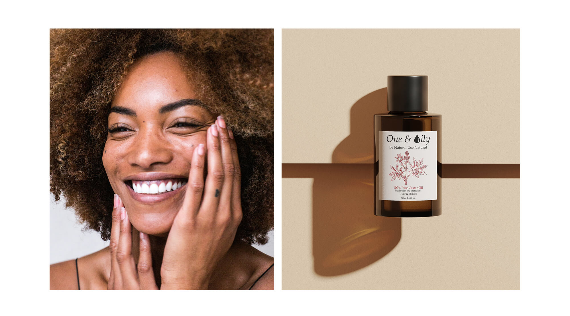
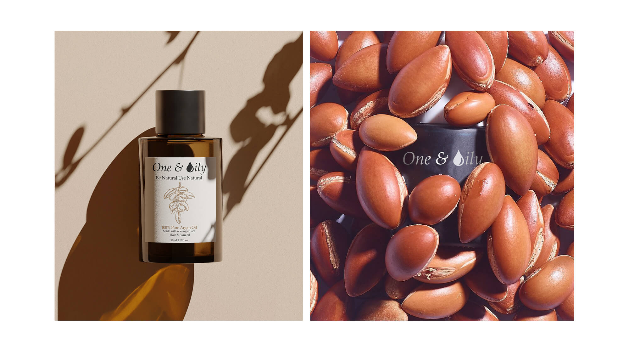
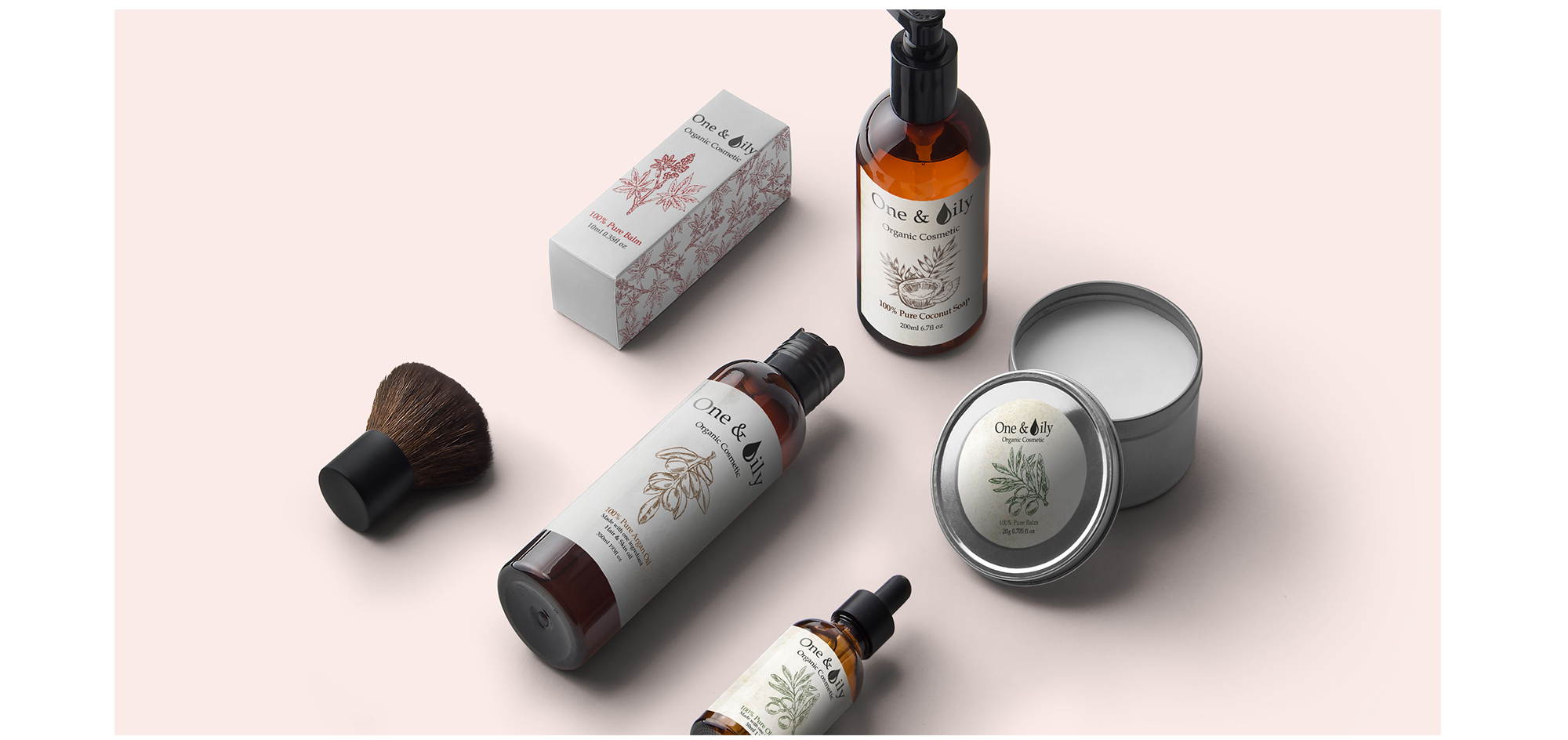
The One & Oily - Re-branding
Regardless of where we live, to one degree or another, air pollution poses serious risks to our health. Scientific research has revealed how ongoing, daily exposure to pollution affect how your skin and hair looks, feels, and even how it ages. HAZ beauty as a result created ‘One & Oily’ oils in order to produce a product that is 100% natural, has only one ingredient and is healthy for all skin and hair types and can reduce the damage caused by weather and pollution. Although the product received a positive feedback, customers (often shop owners) felt that the label didn’t stand out due to clear label on a dark glass bottle.
Stand out from the crowd
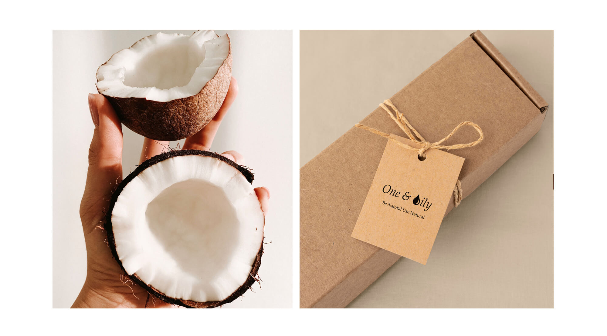
HAZ Beauty, decided to change this by changing the labels as well as the bottles. Due to the feedback from product owners, Haz also wanted to change the bottle as it didn’t reflect the classical beauty product design. We landed on this bottle shape and using a textured paper label with hand drawn illustrations (by myself) to convey the idea of a luxury hair product.
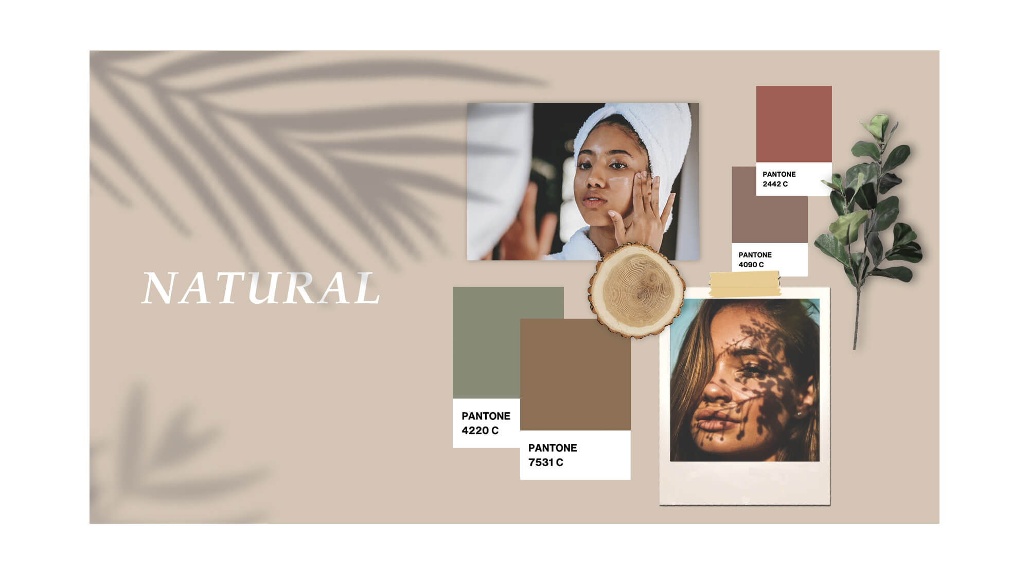
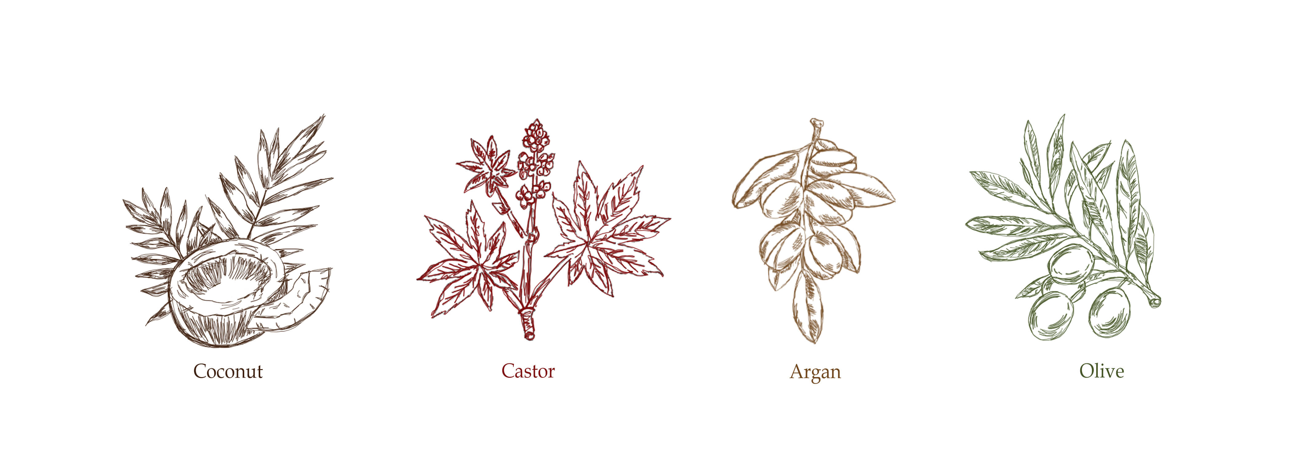
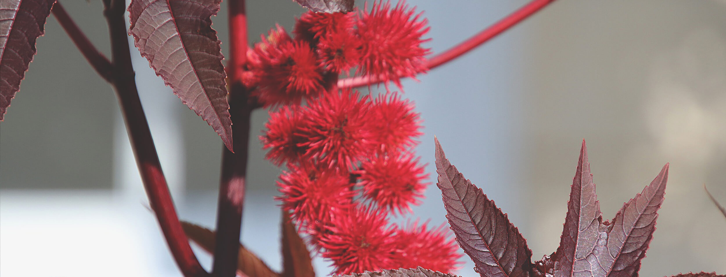
Power of nature
One & Oily relies on the power of nature-based ingredients to optimise the skins and hairs’ natural defences. In order to show the brands unique approach, I wanted to create a design that would reflect this sensitivity to raw and natural ingredients. Sketched illustrations and muted colours on textured paper communicate this to consumers as soon as they see it on the shelves.